When the house next door to their own went up for sale, a pair of Melbourne-based art lovers and collectors spied an opportunity they couldn’t pass up. With the help of Powell and Glenn Architecture and Interior Design, the two separate Federation dwellings became part of a single property, cleverly linked by a contemporary addition at the rear of the block, complete with its own dedicated gallery space. All of this is discreetly nestled within cultivated gardens not so much distinct from, but rather an extension of, the spaces where the living happens.
From the street, you’d never know that the project exists, and this secret garden component makes for an exciting and intimate entry. Through two sets of textured concrete walls shrouded by layered trees and shrubs, a path leads up between the original houses and through a small courtyard, with the contemporary addition beckoning beyond – the kind of garden path you’d willingly be led up.
With a reputation for creating exotic, textured, and layered gardens, working with landscaper Myles Baldwin meant that the architecture and interiors of the home could be pared back. “We were looking for clarity so that the building emphasised and amplified the natural world and its ever-changing nature,” explains Ed Glenn, director of Powell and Glenn. “Once you’ve got that clarity and stillness in the architecture and interiors, then you bring in the chaos and the magic of the garden and the artwork and the people.”
With a neutral palette of timber floors, brick, marble, and various forms of concrete, the foundations are classic and timeless. Working very collaboratively with the architects from the outset, head of interiors Clementine Jacobs worked with the client to select vintage pieces by furniture designers such as Antonio Citterio, Patricia Urquiola and Vico Magistretti to add theatre to the spaces.
“Everything in the interior palette is wanting to add warmth, natural texture, and layer – without taking away from the ability to have a revolving art collection that inject new forms and colours,” says Jacobs.
While quality of light tends to suffer the larger a house gets, Link House avoids this through careful spatial planning, with Powell and Glenn considering the relationship of different spaces to one another to in fact be more important than a building’s form. Principally a study in space, light, and garden, the home’s expansive glass doors and windows bring in natural light, which is strategically funnelled into key spaces and along particular sightlines.
In the living area, the colours of an abstract painting by Miranda Skoczek are picked up in Troy Emery’s Pink Banded Beast, the position of which directs the sight line toward an airbrushed acrylic tree painting by Marcel Cousins, and out to the swimming pool.
The nearby home gallery, which houses about a quarter of the home’s total collection at any one time, harnesses both natural and staged lighting to illuminate an eclectic range of paintings, sculpture, and other art objects that defy categorisation, like the richly textured triptych by Dani Marti adorning one wall.
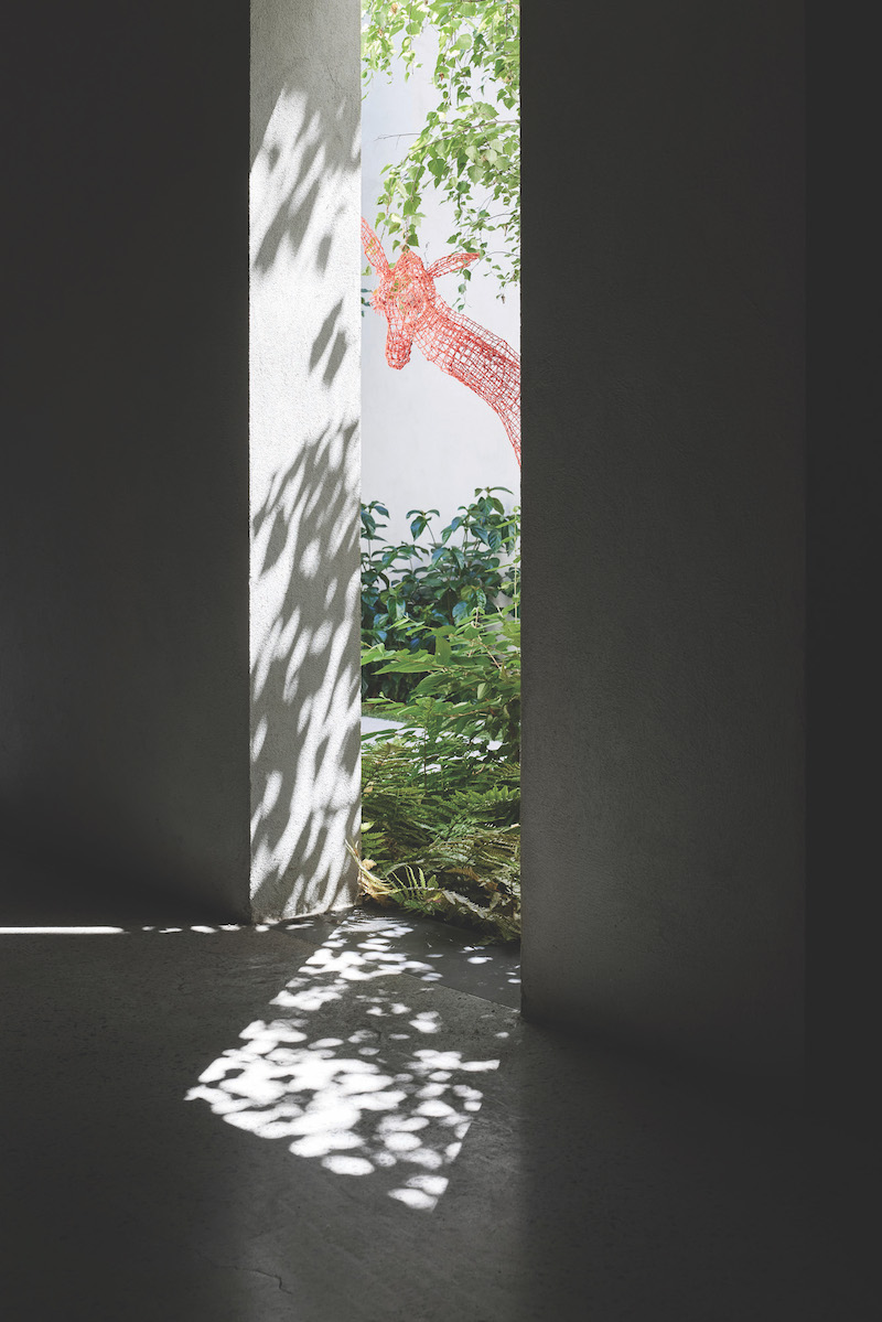
Multiple courtyards, each with their own unique garden ecosystem, also help to punctuate the different spaces. The designers were particularly thrilled with the result of a double-height internal courtyard, adding dimension as it stretches down to the basement level, where Tom Ripon’s Baby Giraffe rests among the greenery. Inside, keeping the dwelling on a single level allowed for soaring 3.4m ceilings, necessary for housing several other large-format artworks.
Early design meetings were lorded over by the imposing cardboard sculpture Human After All by Belinda Dunstan, affectionately referred to as the pregnant transformer. Now standing guard in a second living area, the formidable figure appears inclined towards the diminutive Balloon Dog by Jeff Koons, perched on a coffee table. Is the latter in danger? This playful tension was contrived after the architecture and interiors were finished, when the flexibility afforded by the design meant the client could experiment with different artistic arrangements.
“I think more easily rotated and loosely curated collections liberate people to do things in quite a bold way,” Glenn reflects. “You get those magical moments on site that you just can’t really predict,” agrees Jacobs. As the art collection is rotated, the cement of the external architecture patinates, and the garden continues to grow, Link House may look quite different in a year or a decade’s time. But we can be sure it will remain a celebration of creativity, the beauty of nature, and stand as a testament to the power of great design.
Featured Image: In the garden sits Tom Ripon’s Baby Giraffe. Photos: Sharyn Cairns. Courtesy: Powell and Glenn.

