When the owners of this hilltop holiday home in Palm Beach, Sydney, first bought the property, they were put off spending time in the two-storey beauty by the clichéd beach-themed interiors: all-white kitchens, lounges and bedrooms; nautical decorations like surfboards, shells and model yachts. Their vision was less seaside and more rustic Ibiza or rendered Mexican hues, and Yasmine Ghoniem of YSG was happy to oblige. In a world where neutrals are big in interiors, paired with murmurings of “clean lines” and “bright, airy spaces”, Yasmine is a designer who is not afraid of colour. From marble to upholstery, lamps to artworks and everything in between, her designs are exuberant, bold and full of life.
At La Palma, the house’s newly christened name, the exteriors and interiors now embrace warm terracotta and mustard hues with citrus accents. Marble is a stand-out feature (as it often is in YSG projects) and can be found in a yellow-orange Giallo Siena on the kitchen island and warm red Tibero in the bathroom, plus green Toledo marble in the en suite bathroom and rouge marble coffee tables in the sunroom designed by Yasmine herself. Rather than flat surfaces, there are textures everywhere: handmade tiles, European linen, kimono silk and French wash walls, while patterned textiles can be found in the bedheads, lamps, cushions and upholstery. But there are never so many that they overwhelm.
Most of the artwork was acquired for the project, and one piece – La Pina by Studio of the Sun – proved inspirational for the design team. “This painting was pivotal,” says Yasmine. “We specified this particular piece before we started work on the home, and it inspired much of its tonal scheme and spirit, as many of its colours and motifs are integrated throughout.” The red and white dotted line in the painting was also extended, quite literally, into the interiors by continuing the line across the wall. Expertly painted by Creative Finishes, who also did the French wash walls, the same red and white motif was also used on the raised step from the lounge room to the dining area to highlight a trip hazard.
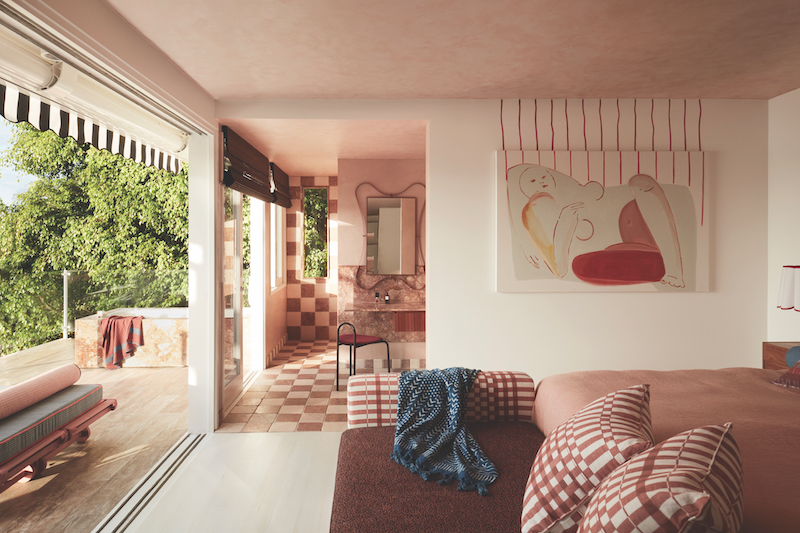
In one of the bedrooms, another painting, this time a nude Repose by Stacey Rees, also has had its red vertical lines continued up the wall towards the ceiling. “The naïve, free-flowing lines extending from paintings really expresses a sense of painting outside the lines in a metaphorical sense and not following any rules,” says Yasmine. “We’ve never actually followed the contours of the painted lines on a canvas upon the walls surrounding them though on other projects, so this was fun.”
The house also features an impressive salon hang in the sunroom, where another work by Stacey Rees, STUCCO, has been hung in the centre, with more than a dozen other works added: a red painting by Tom Mackie; a white ceramic piece, Ghostly Misfit Tiles, by Jan Vogelpoel Ceramics; the painting Volcano Chess by Alex Xerri; the sculpture Full Moon by Bettina Willner; Fan by Elise Cameron-Smith and much more, many of which were sourced at Saint Cloche Gallery in Sydney. Here, the objects are placed on sculptural shelves that form part of the hang as well. “We added some 3D elements via ceramics and two rattan sconces amongst the hang to add textural interest to the flattened framed works,” explains Yasmine. “And come nightfall, assorted works pop in their glow. We also designed a chunky ledge to support pieces so that over time the clients can play around with what they place on it to switch things up.”
For Yasmine, interiors are about personifying a mood, and art can be an integral in getting this right. “It makes your eye stop and pause and observe what’s around,” she says. “Yes, lighting does this, and colour too. But art, be it a painting, photograph or sculpture, allows you to attach any abstract though you want to it. I love that every person’s interpretation of art is personal and, more importantly, equally valid.”
Above: Sunbed upholstered by Re-Materialised, mirror from Rachel Donath, Honed Tiberio marble vanities and splashback crafted by Med Marble, checkered tumbled marble tiles from Aeria County Floors. Photos: Prue Ruscoe. Styling: YSG Studio Design. Courtesy: YSG Studio
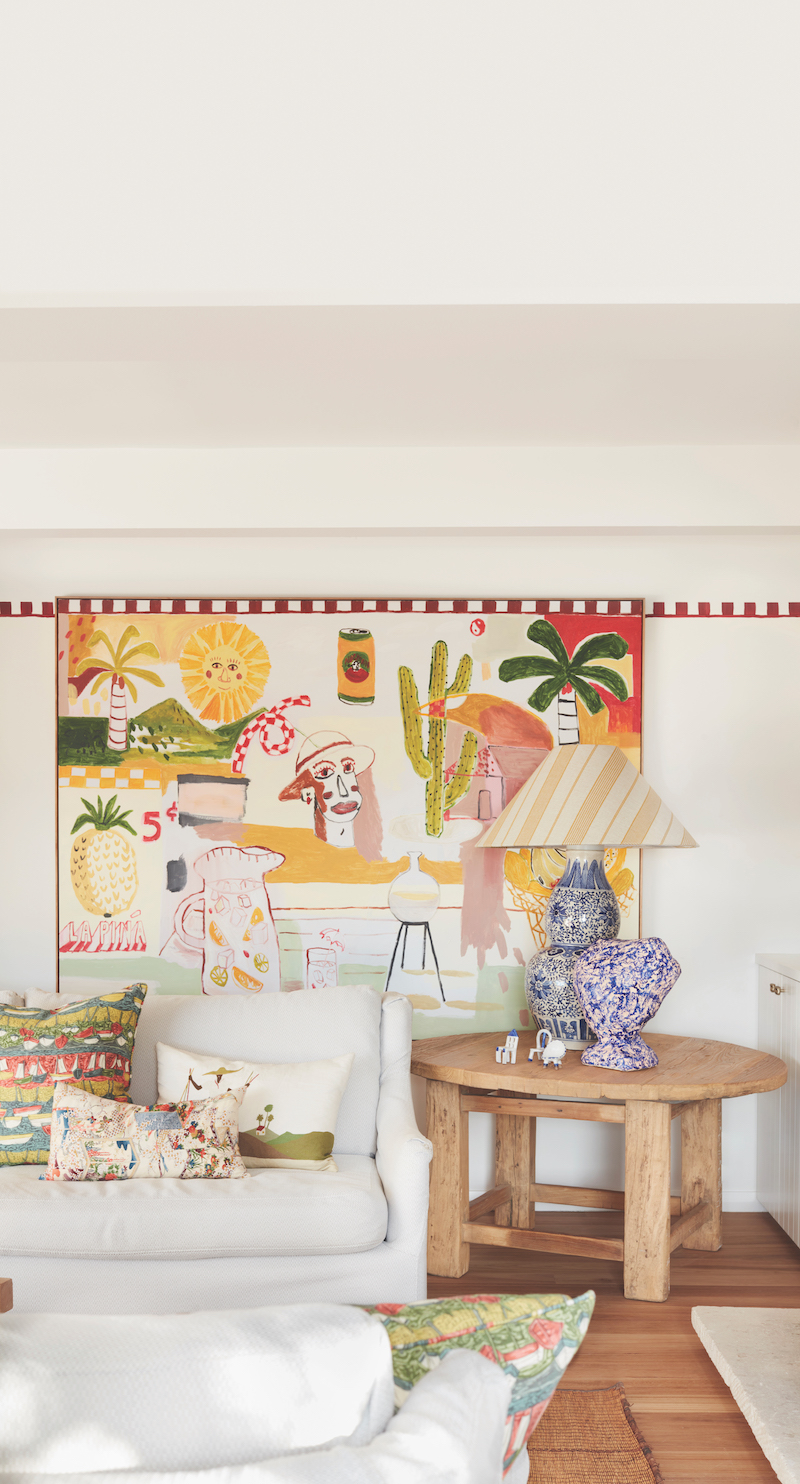
Artwork by Studio of the Sun from Jardan, sculpture Tipping Point by Amber Hearn from Curatorial+Co. and checkerboard wall detail hand-painted by Creative Finishes.
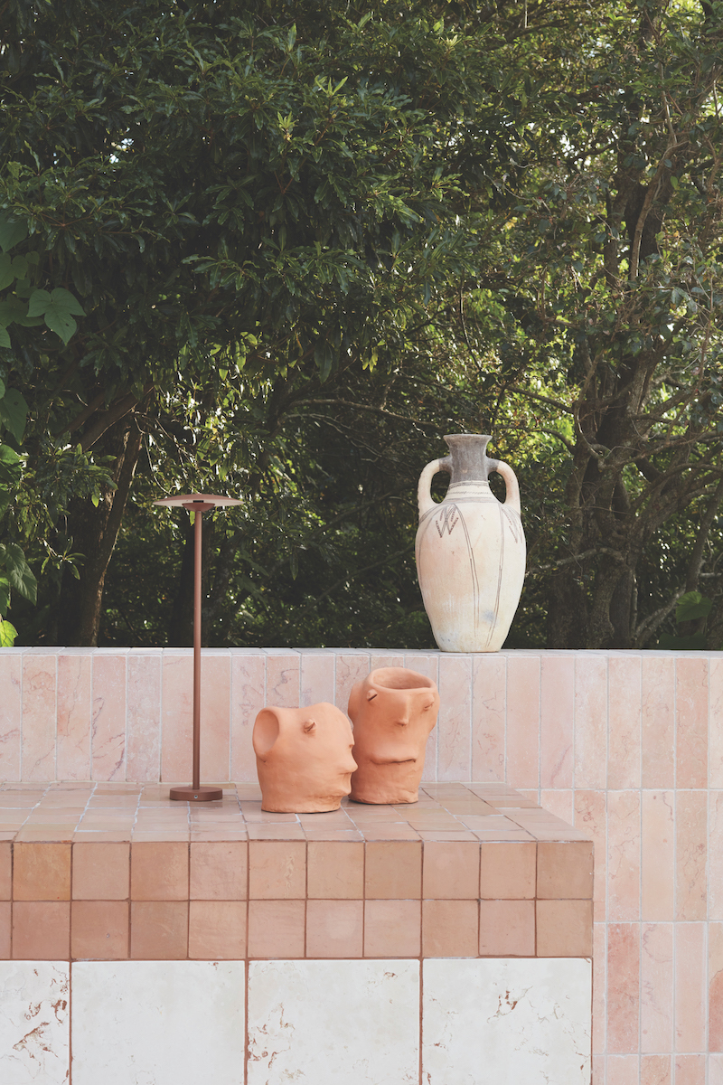
Terracotta heads from Alex & Trahanas placed next to outdoor lamp Ginger Outdoor from Marset and vase from Little Known Makers.

In the dining area, Deeply Pendant lights from The Together Project, tablecloth from Pigott’s Store. Various ceramic crockey from Mud Ceramics.