Do you enjoy restocking or colour sorting? Do you get satisfaction from watching people wrap presents online? Or are you the kind of person who loves to let loose with a bucket of paint – apron, smock and plastic sheet over the studio floor be damned?
These two impulses, for order and for chaos, might very well correspond to moods or phases. But they might also speak to something more meaningful about our personalities altogether, which can impact how we design our homes and hang our beloved art.
For interior designer Lauren Li, founder of sisällä and author of The New French Look, the choice of whether to hang art symmetrically or asymmetrically often begins with the space: How big is the wall? How nuanced are the features? Is the roof flat or pitched?
“If the wall is symmetrical or has evenly spaced windows, then a symmetrical arrangement will work,” explains Li. An evenly spaced hang might also work if you have multiple works that are the same size within the same frames.
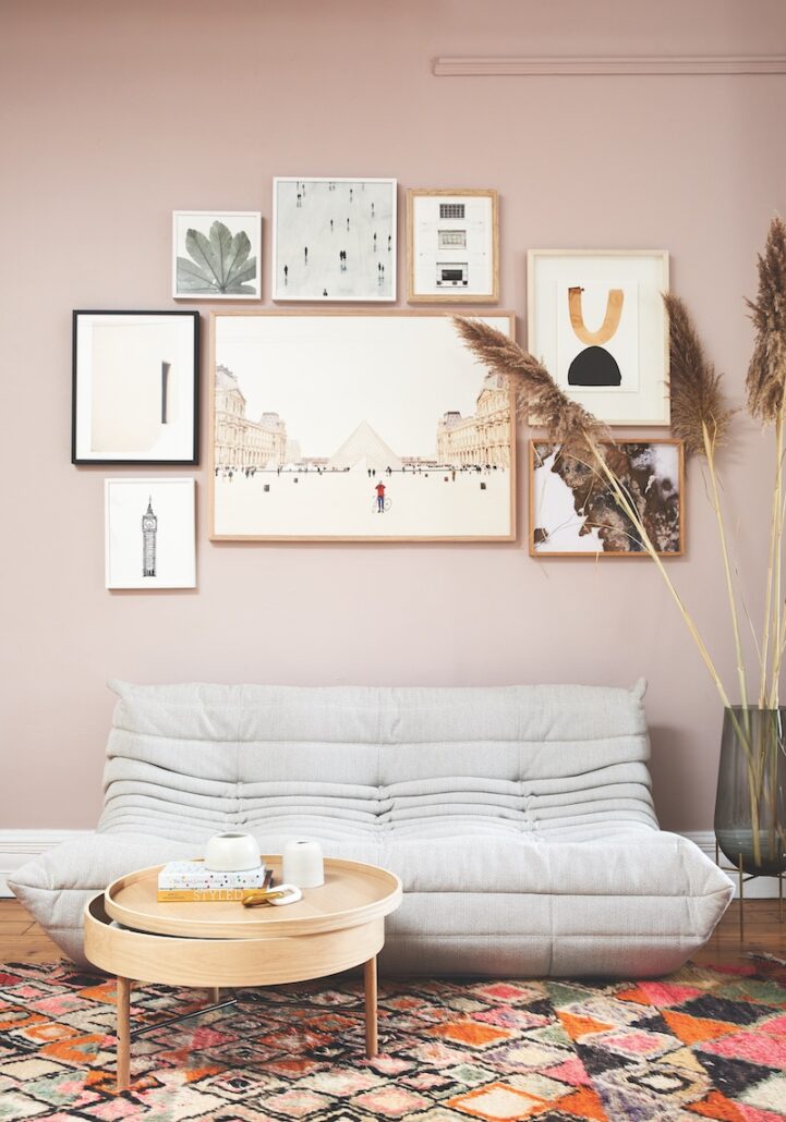
On the other hand, if you have an asymmetrical wall or want to arrange artwork around features such as wall lights, furniture or a television, it might work better if the work is hung asymmetrically. This is where a gallery wall or a salon hang will create a favourable aesthetic.
Li recommends collecting your works together then starting with a larger or darker piece at the bottom and going from there. Feeling adventurous? Try mixing the paintings and works on paper with sculptures or ceramics. “It’s about balance,” says Li. “Start with the biggest piece in the middle, then place the remaining works around that, sometimes with darker tones down the bottom and lighter ones up top.”
For Li, it can also depend on the client – that internal pull they might have towards either order or chaos. “Sometimes they want to see everything lined up. It makes them feel calm; it makes them feel like things are in order. But sometimes they want to lean into something a bit eclectic. They want it to feel relaxed and not so uptight.”
But while our aesthetic preferences and the characteristics of our walls typically determine how we display our art, oftentimes the artworks themselves can influence the place and positions of how they’re hung. And this is where the Greek gods come in.
German philosopher Nietzsche wrote about two impulses in art: the Apollonian and the Dionysian. Inspired by the Greek gods, Apollo stood for order, reason and calm, whereas Dionysus was the mark of strong emotions, excess and chaos. In art, you can see the Apollonian in figurative works like portraits or landscapes, while more expressive works like a Jackson Pollock might tap into the Dionysian – quite fittingly also the god of wine. Thus, the lean of your artworks – towards either the Apollonian or Dionysian – can also end up playing a significant role in how you present your collection.
So, which does Li prefer? Order or chaos? “For me, I like it to feel looser and more relaxed,” she says. “For somebody else, it could be too chaotic and eclectic, but measuring between each frame is too exacting for me.”
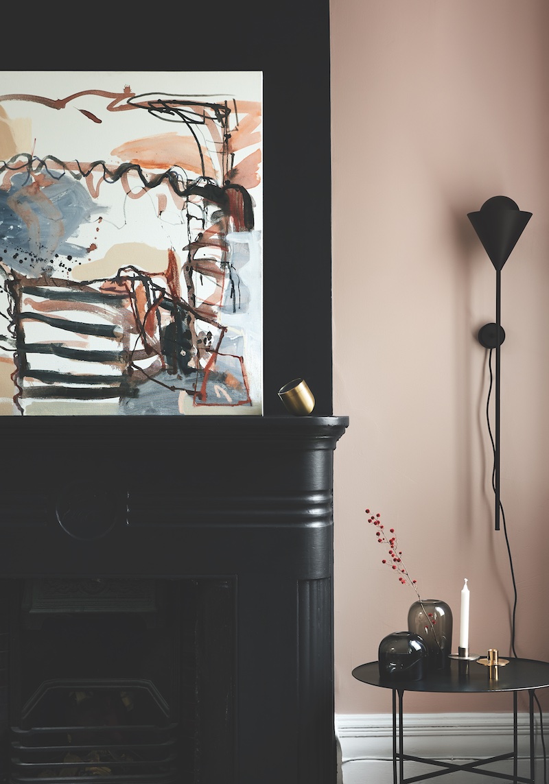
Above: A painting by Melissa Boughey sits on a mantle in the sisällä studio space. Photo: Tess Kelly.

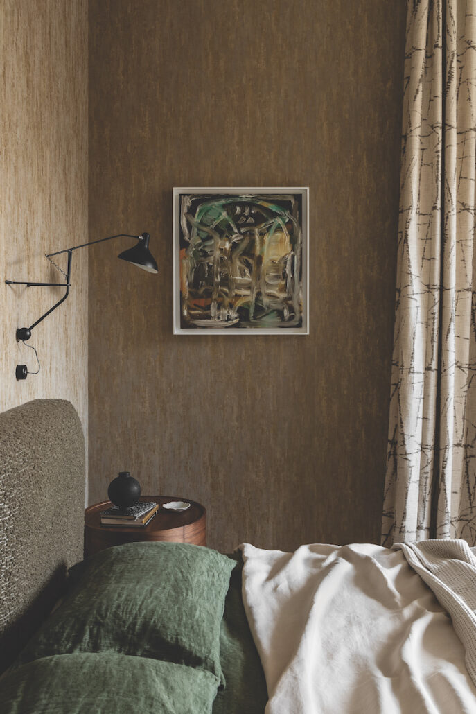
An expressive painting by Eleanor Louise Butt complements the textural elements of this bedroom. Photo: Timothy Kaye

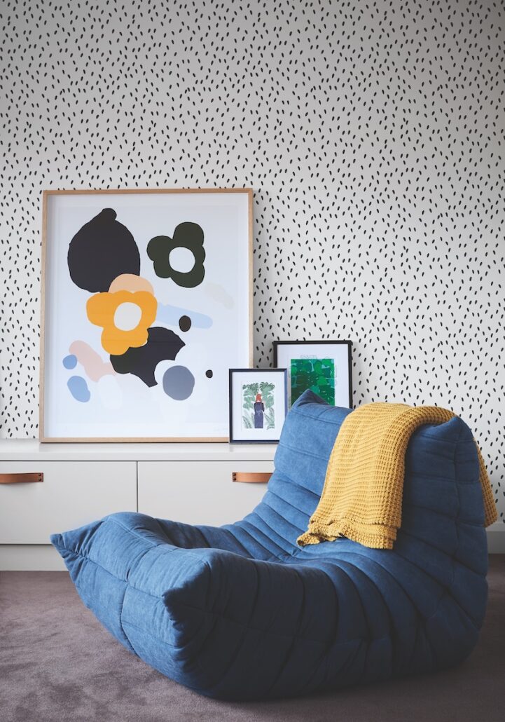
Main artwork by Kirra Jamison. Photo: Tess Kelly

At the sisällä studio, a salon hang starts with a strong work placed in the centre. Collected pieces include an abstract watercolour by Anne Miller and ariel landscape artwork by photographer Maegan Brown. Photo: Tess Kelly

