When displaying art we almost always envisage a big, white wall with a statement art piece floating within it. This stark way of displaying art seems classic, however, in the great history of everything, it’s really very modern.
The whole white walls trend appeared with Modernism in the early 20th century, only gaining popular ground in the 1950s and 60s. Prior to this, art was almost always displayed on top of coloured, papered, panelled and even tapestry and silk covered walls, depending on the era.
This year, we’re seeing a serious move towards maximalism in our homes, after decades of minimalism (from futuristic early 2000s, to the creamy boho of the late 2010s), and pattern mixing, mashing and clashing is finding its way back into decor.
Plain curtains are being swapped out for lush patterns, and white walls are being decorated with intricate designs. But, what does this mean for our art collections and their display?
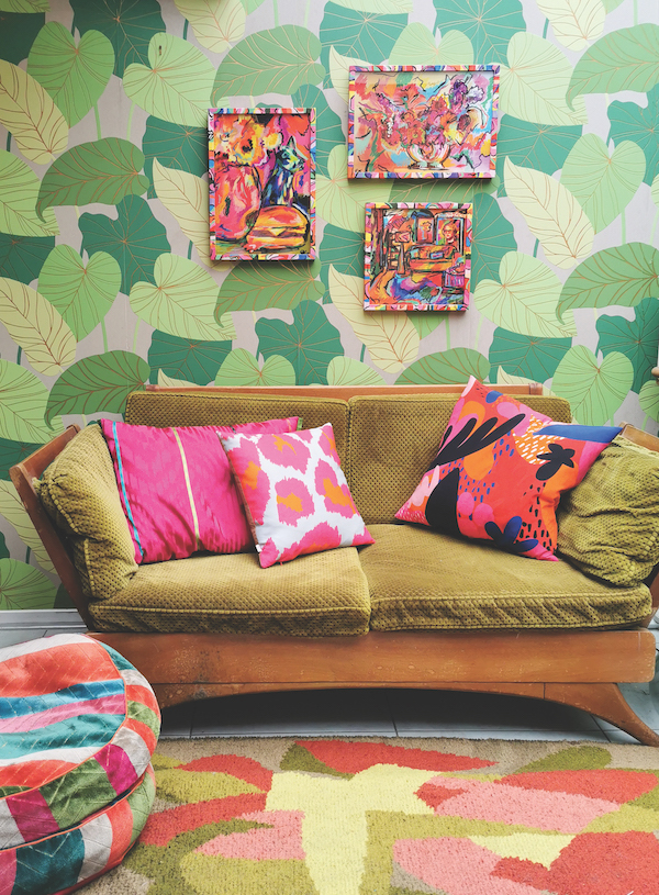
There is a common misconception that busy walls will detract from the artwork displayed, but I believe that the right combination of art and wallpaper can elevate your art. You can use pattern to accentuate colour and form in your art pieces, or to continue the feeling of a painting beyond the edges of a canvas. A small print can become the key to an entire room when paired with a contrasting wallpaper. I like to think of it like fashion, you can wear a beautiful brocade coat with jeans and a t-shirt and it looks great, but Gucci would pair it with patterned trousers and a floral shirt to a completely different (and fabulous) effect.
So, perhaps you’re feeling like you want to bring in some wallpaper into your home and wondering how to get it right. Here are a few tips for art lovers to narrow down the decision and get it right.
TIP 1 / Start with the art.
You need to decide if you want the colour of your walls to either: A: Complement the art. For example, a wall of landscape paintings on a soft sage green is a natural combination that looks sophisticated and calming. Or B: Contrast with the art. This is taking the prominent colours in the art and choosing something with a contrast – usually opposite on the colour wheel, for example burnt orange or pink walls with a bold blue abstract will make the artwork pop.
TIP 2 / Choose a wallpaper style.
Again, it’s fun to play with contrasts – the beauty of a painterly abstract can be exaggerated by teaming it with a bold geometric, like a stripe or check, and contemporary photography juxtaposes brilliantly with a busy floral. Keep in mind that it’s the combination of both elements that creates the distinct vibe. A classical wallpaper behind a gallery wall of traditional figurative works will feel very different to the same wallpaper hung with a modern piece which will feel much edgier – both work well but you want to be sure of the look you want to achieve.
TIP 3 / Think about scale.
In general, when the elements within your wallpaper are similarly sized as the elements within your art, the artwork tends to blend in more with the background. Of course, this might be a design decision! Small and very large scale prints tend to recede more as our eyes read them as areas of colour rather than objects – perfect for if you really want to make your art stand out.
TIP 4 / Try a wide range.
Order a range of wallpaper swatches and tuck them next to your favourite art to see how they work together. Always take some risks when choosing samples, it’s just as helpful to know what you don’t like, as what you do! You might just be surprised!
TIP 5 / Don’t forget the framing.
Speciality framing in a new colour can completely change an artwork and how it displays. Contrasting coloured frames on a patterned wall can define the artwork in an eye-catching and exciting way. For a pattern overload there is a growing trend for fabric covered frames and mats that add an extra level of maximalism.
TIP 6 / Have fun with it.
This is my last word on decorating, always. Think about how you can create something that makes you happy – maybe it’s a witty but subtle reference in your wallpaper motifs, or a bold mural to sit behind a wall of black and white portraits.
Your art, and your home should constantly surprise, delight and inspire, and I can’t think of a better way to create that than adding more art.