We all have our favourite colours, right? But have you ever stopped to consider why you might be drawn to certain shades? As a colour lover in the strongest sense, it is often surprising which combinations have my heart, like chartreuse and lilac, or duck egg blue and apple green. Their stark contrast is what makes them so interesting to me. Colour is energy made visible and, luckily, we get to choose what hues to surround ourselves with. The colours in an artwork are often the first thing we’re drawn to, but it’s also important to consider the palette of the entire room, and how your art combines with other décor pieces. Here are some tips to get you started.
TIP 1 / Have a plan
Before you start unleashing swathes of colour in your home, think about the mood you want to create in each space. For instance, if you are after peace and tranquillity in the bedroom, avoid bright colours and opt for more pastel and subtle hues. Colour can turn the volume up or down, so use it to your advantage!
TIP 2 / Find your true colours
Colour, and how much you use of it, is entirely personal. The key to using colour is to commit to it. Try using variations of your colour choices as accents throughout a home to create a considered and unified look. If you are not confident with mixing colour combinations, colour authority Pantone has created an app, My Pantone, which will do it for you. It takes the science out of colour combination selections and offers advice on complementary colour schemes. If colour mixing isn’t your thing, it can be equally as effective to stick with a single hue. If you prefer just one colour, try using it in different shades for maximum impact. For instance, an ombre effect can be very striking and is always complementary.
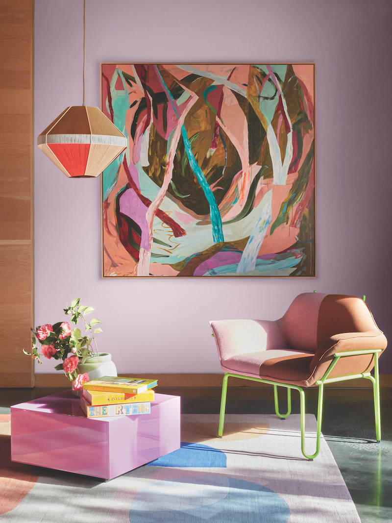
TIP 3 / Art as arbiter
Art is a wonderful focal point with which to ground a space. You can make any room feel considered by pulling out colours from an artwork which, in turn, will make your colour combinations feel more considered. Then repeat that colour in three places for unison in the room. I often allow the art to dictate other decorative decisions in a room – after all, it is usually the first item I have purchased and everything else has to fall into place alongside it. The key here is to choose one colour from within the body of the artwork, and reference it through soft furnishings or other decorative objects. This will make the space feel connected.
TIP 4 / Lean in
Sometimes it’s the tried and true colour combinations which work best, and sometimes something more imaginative can be called for. In fact, more unexpected combinations can be incredibly impactful, and often a soft mixed with a bold packs some extra punch. One of my go-to combinations is a soft duck egg blue mixed with punchy chartreuse – this is a surprising combination which seriously works. While bold colours can make a strong impact, they aren’t for everyone and they don’t work in every environment. If you feel bright colours are a bit too much for you, opt for more timeless combinations such as black and white that still pack a punch decoratively but tend to never go out of fashion.
TIP 5 / Let it pop
Think about using dark walls rather than white. While a white wall will certainly create contrast against bold colours in an artwork and will provide a fresh feel, in my opinion a moody hue will showcase the colours of a work even better.
TIP 6 / Take your time
If you’re afraid of colour, go slow. Add measured amounts of it to start with and live with it for a while before deciding on how much to add or subtract. As you grow in confidence, you’ll learn what works and what doesn’t, and you’ll be weaving your colour wand with authority.
This colourful photoshoot coincides with the release of the new book Vivid: Style in Colour by Julia Green and Armelle Habib; a book that explores the psychology of colour. Vivid: Style in Colour is available through all major book stores or via greenhouseinteriors.com.au.
Featured image: Chris de Hoog’s limited edition print Favourite Spot hangs with a pendant light from Werajane Design. All images are styled by Julia Green and Aisha Chaudhry for Greenhouse Interiors, assisted by Linda Hutchinson and Jillian Nielsen. Photos: Armelle Habib.