The inclination for people of vastly different temperaments to come together and find balance in each other is a well-known phenomenon – opposites often attract, so the adage goes. But what happens when two people with diametrically opposed aesthetics try to build a home together, from scratch?
They call in Anna Trefely of Sydney-based interior design studio Esoteriko, whose accolades include winning the Interior Design Excellence Awards’ prize for an Emerging Designer in 2020, coming in as a finalist in the 2021 Dulux Colour Awards for her commercial interiors, and making the shortlist in The Design Files Awards and Australian Interior Design Awards, among many others.
After a nomadic life of jetting around the globe, a young family settled on a spectacular plot in eastern Sydney and approached Trefely with the challenging brief of balancing their tastes without any compromise. On one side was a client who wanted a distinctly industrial aesthetic, whose dream house possessed an almost austere, museum-like quality rooted in mid-century design. On the other was a client who wanted something overwhelmingly comfortable, filled with layers of natural texture and warmth.
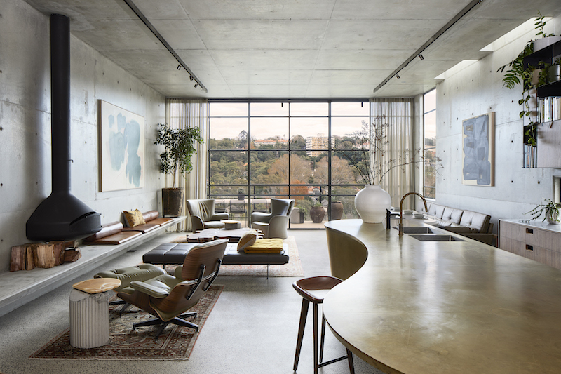
The aptly named Concrete Bunker in the Treetops was born of these two visions, combined with Trefely’s own insights into the potential of their chosen site. “Their view is not the typical Sydney skyline”, says Trefely. “It’s looking back on to the valley, bringing in so many colours from the trees, the changes of the seasons, and houses around. It is so overpowering, this view, so arresting.”
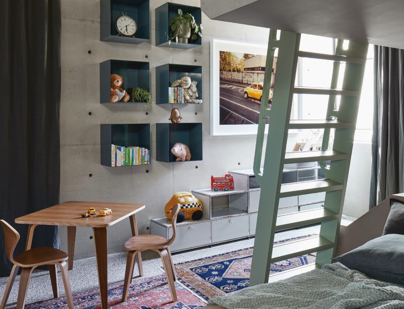
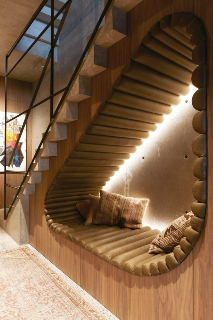
By pulling the outside in, Trefely’s design brings a balancing warmth to the sharp lines and shapes of the building without diminishing the impact of its vast swathes of concrete and steel. A key part of this process was curating the family’s art collection, which was built up nearly from scratch for the project. Their existing collection was mostly small pieces accrued over a lifetime of travel, sized to fit in a suitcase. They carried stories of meeting artists and exploring places around the globe, and Trefely integrated this into her selection process when acquiring larger pieces suitable for their now substantial wall space – most notably in the children’s bedroom, where a photo taken by a close friend, Daniel Nadel, was blown up and professionally framed to add a pop of colour and class.
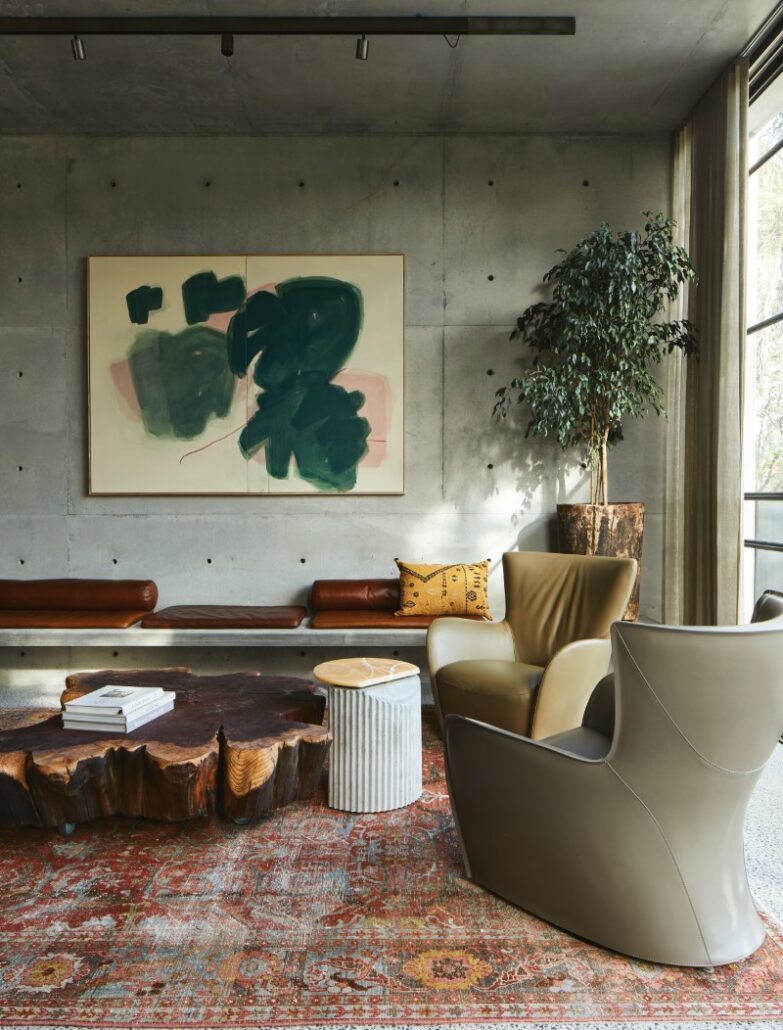
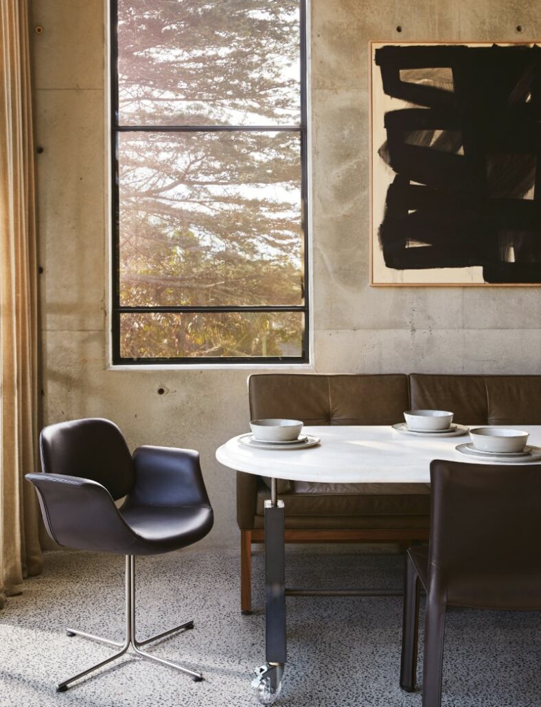
Colour was key in selecting works for this home, to bring movement and life to the severity of the concrete. Yvonne Robert’s Florals 03 Diptych takes pride of place in the main room of the house, its intense whorls of green and pink drawing in the colours of spring from the valley below into the living area. It sits in conversation with another of Robert’s works, Monochrome Black 01 situated opposite above the dining area, their vigorous strokes bringing the two 3 parts of the room together into a harmonious whole.
The selection of these works was a product of passion. “I showed them a lot of pieces I really loved, but they didn’t feel the same way – they said they liked them, but they didn’t feel any sort of intensity about them, so they were discounted straight away,” says Trefely. “It is one thing for me to love it, but it is most important for the client who lives with it to love it. If there was no excitement, we needed to move on.”
Curating a collection for a client is an artwork in itself, and Trefely’s success lies in her ability to select pieces for her clients that work toward the overall aesthetic of the interior without compromising their desires. The design features throughout the home were also carefully curated in order to combine aesthetics with elements that elicit these feelings of passion and excitement. When building a house from the ground up, from the sofas to the napkin holders, it is vital that these components work together to make a house feel like a home.
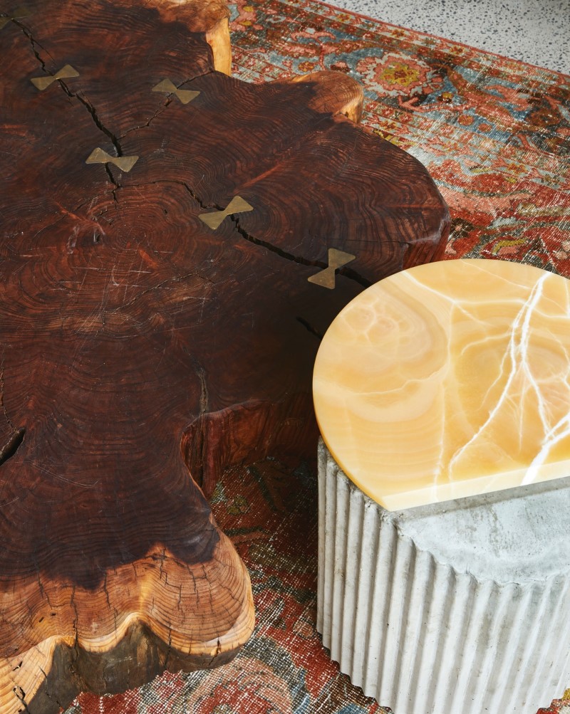
Trefely often creates bespoke pieces to that end, and in this project the most central custom piece she created is the magnificent coffee table in the main room. She sourced a stump that suited the spatial needs for the room several hundred kilometres out of Sydney, and dispatched the client himself to claim it.
“Our client loved the process of making this house, he lived and breathed for it, and so sending him out on a truck to get this trunk was his absolute dream,” says Trefely. “He loved it, he had so many stories about it.” By involving the client in the creation of key pieces for the home, she helped them create memories that brought the design to life. After the trunk made its way back to Sydney, it was delivered into the capable hands of Hugh Worthington of Chunk Design, who painstakingly restored it (with a little help from Trefely herself), setting off the natural vibrancy of the wood with brass butterfly joins. This piece brought together the briefs of both clients, with its natural beauty and industrial accents, creating a focal point for their new home.
Trefely’s Concrete Bunker in the Treetops is a design feat without compromise. It melds industrial design with warmth and comfort, bringing two opposing aesthetics together to create a space that is permeated with a sense of life. With her attention to detail and inventive approach to bringing the outside in, Trefely proves once and for all that opposites really do attract.
Featured image: Yvonne Robert’s Florals 03 Diptych takes pride of place in the main room of the house on the left wall. Robert’s Monochrome Black 01 hangs opposite above the dining area. Photos: Dave Wheeler. Courtesy: Esoteriko, Sydney.
