If you’re a minimalist by nature, you’ll likely have less art to display, so the emphasis is going to be on quality – not quantity. And with the new art you’re about to buy, it would be wise to stick to a neutral colour palette in the art itself along with the environment in which it will hang to ensure there is a sense of calm and simplicity… which is presumably the feeling you’re going for. In the hang itself, allowing ample space between each piece will let the art breathe and contribute to an overall feeling of openness. Aim for simple, understated frames that don’t draw attention to individual works, and align your art in a clean manner. If possible, stick to a consistent theme, as maintaining a cohesive style reinforces the minimalist approach. Best tip of all? Also allow the walls to breathe. Don’t take up every inch of space with art, as that will clash with the sense of an ordered approach.
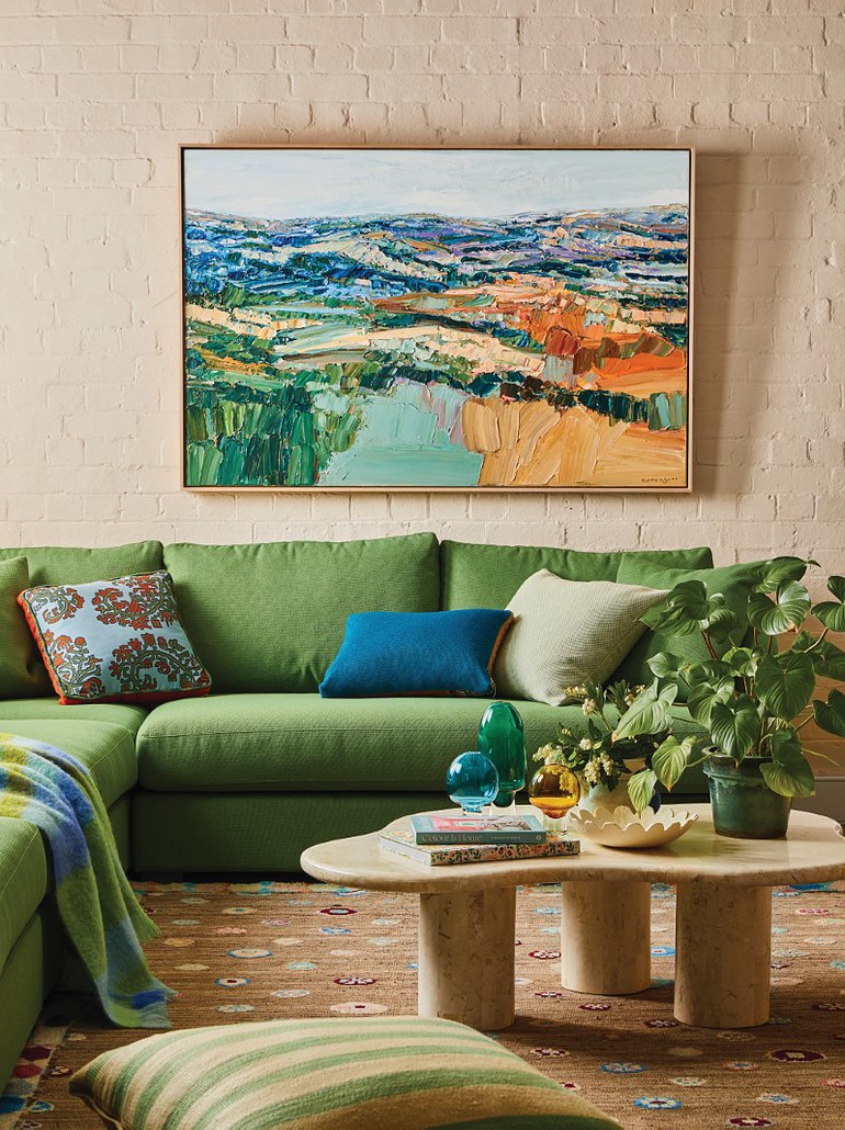
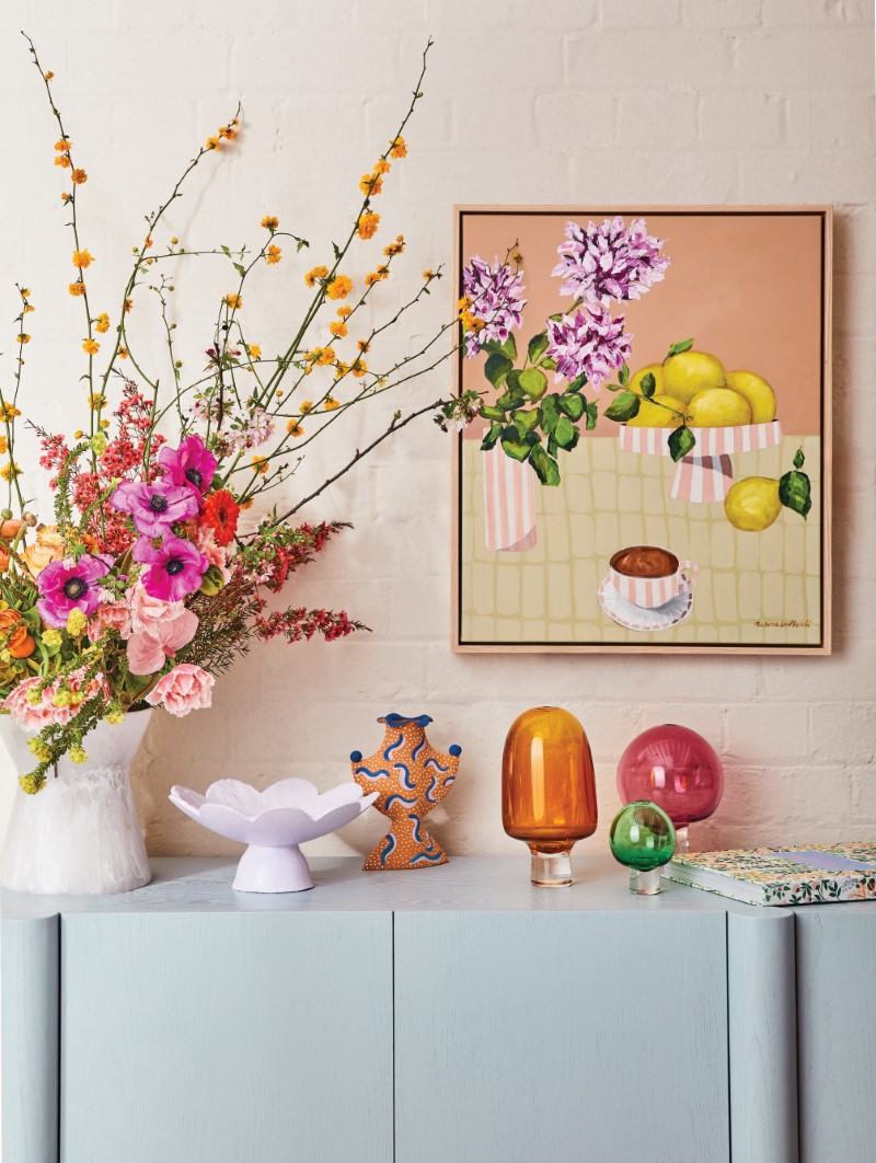
Naturally, the opposite applies for the maximalists out there! Fill those walls with a mix of sizes, shapes and styles, be bold with colour, and don’t be afraid to mix patterns and textures to create a visually stimulating display. Try to mix up your mediums, and combine paintings, sculptures, photographs and textiles! Layer up the mix, ensure the frames clash, and experiment with different heights and scales for a more dynamic finish. Be sure to add personality to your collection to make the space feel more lived in.
Whether you’re a minimalist or maximalist, configuring and grouping artworks can trip anyone up, and I’ve seen a range of successful to unsuccessful hangs in homes. If unsure, a clever key is to unite them with a horizon line, so even if they are different sizes and styles, they have the one commonality of sharing a horizon line. But the way you handle and configure the artwork in your home depends on its style.
If you are a maximalist, you will have more leeway with cluttered walls, mixed frames and styles, whereas a minimalist home will usually suit statement pieces better, whether they be small or large. Less is more with minimalistic homes. In fact, I am often reminding people that not every wall needs to have artwork – sometimes breathing space for existing works is a smarter option.
Clear as mud? Don’t be dismayed. At the end of the day, it’s as simple as wanting to live with the artwork and what it will bring to you daily. Where you hang it, who it hangs with and its palette and style are secondary, and, in good news, almost always remedied with some thought. But, having said that, there is a bottom line. Whatever camp you reside in? Own it. Because if you go half-baked, the cake won’t rise!
Above: Ceramics by Formantics, a bowl by Ode to Elma and glass vessels by Hothaus curated with an artwork by Prudence Demarchi. Photos: Stephanie Rooney. Styling: Julia Green, Nikki McGar, Kylie Harris and Felix Cole. Courtesy: Julia Green and Greenhouse Interiors.


