The paintings of Aaron Fell-Fracasso could be aerial maps of distant farmlands, or macro studies of marks left by critters in sand. They could be well-considered studies of colour and texture, or haphazard etchings left by an intuitive hand. They are questions with answers left unwritten; stories with no fixed narrative; ideas with resolutions still in flux. The beauty in Fell-Fracasso’s new body of work lies in its open-endedness where possibility plays across surface.
Born and bred in Wollongong, Fell-Fracasso spent his teens and early-20s working construction on the railways; hammering, digging, lifting and heaving with great physical force. Today, this physicality manifests in his paintings, honed through his studies in Visual Arts at the University of Wollongong. Though minimalist and abstract in appearance, their construction echoes physical labour as Fell-Fracasso builds up and drags paint across wooden surfaces. One of the artist’s signature practices is his use of construction tools such as concrete scrapers, glue combs, trowels and edgers.
“These tools really lend to something quite physical,” says the artist. “You’d normally use these tools with concrete or grout or something like that, so transferring them to a painting medium you get much more of a physical, visceral kind of quality to the work.”
Fell-Fracasso’s paintings begin long before these tools, or even paint, enter the picture. Construction timber such as weetabix board and particle board are sized up and added to with found hardwood, such as in his recent work Orange Oxide Rendered on Umber with Painter’s Plank, 2023, or expansion foam such as in Yellow Ochre Rendered on Yellow with Pink Particle Board, 2023.
Within the oil paint itself, Fell-Fracasso adds sand to develop rich texture. A continual thread within his practice is this idea of construction, from the board preparation and the application of paint right through to the artwork titles which are literal breakdowns of the materials used. “I’m really trying to stay away from anything representational,” he says. “The works may be representational in the macro form, like a rendered wall in Italy for instance… those kinds of reproductions of surface interest me.”
While Fell-Fracasso’s early works took on a monochromatic palette, his new series introduces vivid colour combinations such as burnt umbers or ochres with cobalt blue and red. These colours come from the materials themselves such as the blue of construction timbers, which the artist describes as “floating within the space of the works”. From here, Fell-Fracasso has fine-tuned the art of pinning these colours down with bold and deliberate executions
of accents.
“There is a real caustic kind of palette, sort of like a mid-century ceramist with umber and cobalt,” he says. These elemental colours contribute to the artist’s intent to unpack the very mediums and methods he employs. Yet the fruits of this intent are not always so clear cut. “Trying to find joy in something is actually really difficult. Sometimes you will find toil instead,” he admits. “There is a push and pull in the surface of the work. When there is the right amount of tension across the picture plain, that’s when I know a work is done.”
Fell-Fracasso’s plate might be full with a solo show around the corner, not to mention his position as founder/director of Egg & Dart in Wollongong, but he continues to push the limits of his capabilities and his materials, hinting at a new direction into sculptural works.
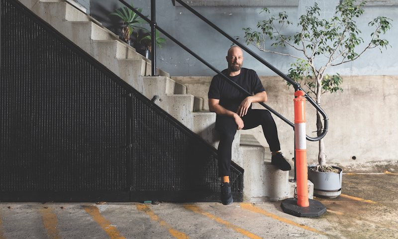
Above: Artist Aaron Fell-Fracasso. Photo: Jennifer Leahy. Courtesy: the artist and Egg & Dart, Wollongong.
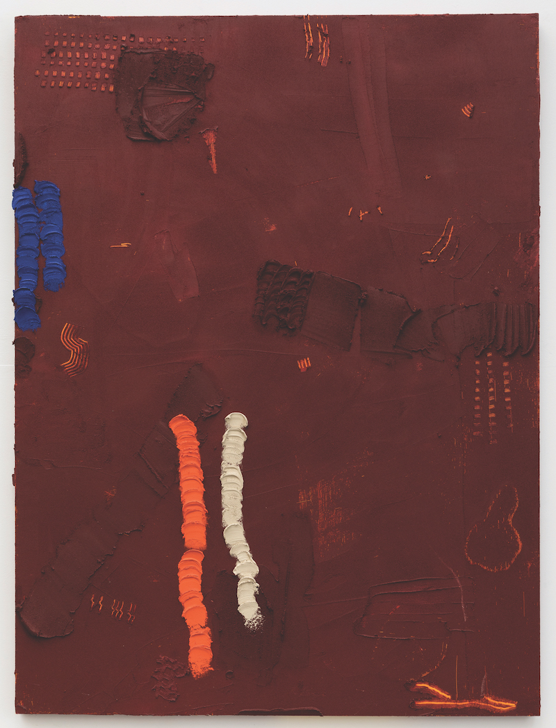
Aaron Fell-Fracasso, Maroon Rendered on Yellow, 2023. Oil, sand and acrylic on board, 162 x 121.5cm. Courtesy: the artist and Egg & Dart, Wollongong.
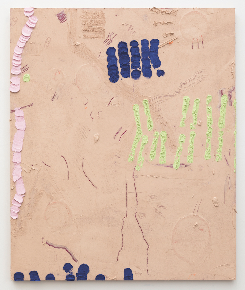
Aaron Fell-Fracasso, Pinkish Grey Rendered on Maroon, 2023. Oil, sand and acrylic on board, 147 x 122cm.
Courtesy: the artist and Egg & Dart, Wollongong.
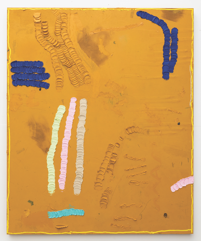
Aaron Fell-Fracasso, Yellow Ochre Rendered on Blue, 2023. Oil, sand and acrylic on board, 182 x 150cm. Courtesy: the artist and Egg & Dart, Wollongong.